
If you’re a current follower of this blog then you may already know that I’m a bit of a fan of using plain text accounting for managing finances.
I mainly use the Ledger text file format and CLI tool for bookkeeping and reporting on finances. This works great, and I can quickly and easily generate different kinds of reports using a range of simple Ledger commands.
For example, to generate a quick income/expenses balance sheet for a particular date range I can run ledger balance income expense -b 2022/03/01 -e 2022/03/31, which produces something along the lines of the following:
             £381.50  Expenses
             £129.87    Hosting
             £185.00    Services:Accountancy
              £66.63    Software
          £-1,000.00  Income:Sales:Contracting
--------------------
            £-618.50
Whilst this approach allows for easy numeric reporting for accounting purposes, by default there are no built-in ways for visualising the flow of money.
In this post I’ll talk a little about how to use Python to generate a simple visualisation of financial flow when provided with a Ledger export. This consists of three key steps:
- Outputting data from Ledger in a readable format;
- Processing the data;
- Outputting a diagram that visually represents the data.
Step 1: Outputting Ledger data
Ledger provides a number of commands that allow for exporting and reporting on a ledger file. I recommend reading the documentation for a full idea. However, in this case, we can simlpy use the csv command to generate an output that can be easily piped into a Python program.
For example, ledger csv income expense -b 2022/03/01 -e 2022/03/31 produces an output with each transaction on its own row in CSV format, along the lines of below:
"2022/03/01","","Linode","Expenses:Hosting","£","40.58","",""
"2022/03/01","","Company1","Income:Consultancy","£","-120.5","",""
"2022/03/01","","Accountancy Company","Expenses:Services","£","200.28","",""
"2022/03/03","","Company2","Income:Sales","£","-900.0","",""
...
We can write some simple Python now to receive this data into our program. Create a new Python source file (e.g. viz.py) and add these contents:
import sys

# Define a Transaction class
class Transaction:
  def __init__(self, account, value):
    self.account = account # The account name for this transaction
    self.value = 0 - float(value) # Income is negative

# Prepare a list of transactions by reading from stdin
transactions = []
for line in sys.stdin:
  line = line.replace('"', '').split(',')
  transactions.append(
    Transaction(line[3], line[6])
  )
The code above reads in lines from stdin and instantiates Transaction objects for each line. We can invoke this code by piping the output from Ledger directly into the program:
ledger csv income expense -b 2022/03/01 -e 2022/03/31 | python viz.py
In this post, I’m only really interested in the financial flow (i.e. the values of transactions), and so we don’t need to capture payees or other information from the transactions.
Step 2: Data processing
The next step is to process the transaction data. My aim is to achieve a Sankey diagram that shows the flow from income to expense accounts, and to illustrate any profit.
As such, we need to build some account data for the various accounts in our Ledger file.
To do so, add the following code to your viz.py file:
# Instantiate an Account class
class Account:
  def __init__(self, name, value):
    print(name, value)
    self.name = name
    self.value = value

  # In the Sankey diagram, show income coming in from above and expense going downwards:
  @property
  def orientation(self):
    if self.value < 0: return -1
    if self.value > 0: return 1

accounts = []
for transaction in transactions:
  t_accounts = transaction.account.split(':')
  top_level = t_accounts[0]
  account = next(filter(lambda a: a.name == top_level, accounts), None)
  if not account:
    account = Account(top_level, 0)
    accounts.append(account)
  account.value += transaction.value

# Calculate profit
profit = sum(map(lambda t: t.value, transactions))
if profit > 0:
  accounts.append(Account('Profit', 0 - profit))
In the above code, we declare an Account class and then iterate through our transactions to build up a list of Account objects, with each having a total value representing the sum of all transactions involving that account. In this code, for now, we only consider the top level accounts (i.e. Income, Expense) rather than deeper levels (like Income:Sales).
In the last few lines above, we work out if the reporting period is profitable. If so, we manually create a Profit account with the left over value so that this can be visualised in the diagram.
Step 3: Producing the diagram
We’ll make use of the matplotlib package for creating its own version of a Sankey diagram. Install this package in your environment (pip install matplotlib) and then import the required modules at the top of viz.py (below the sys import):
from matplotlib.sankey import Sankey
import matplotlib.pyplot as plt
Then, at the bottom of your viz.py file, add the following code:
fig = plt.figure()
ax = fig.add_subplot(1, 1, 1, xticks=[], yticks=[], title="Ledger Financial Data")
sankey = Sankey(ax=ax, unit='£')
sankey.add(
  flows=list(map(lambda a: a.value, accounts)),
  labels=list(map(lambda a: a.name, accounts)),
  orientations=list(map(lambda a: a.orientation, accounts)),
  patchlabel="Income and expense"
)
sankey.finish()
plt.show()
In the above code we instantiate a new figure, axis, and Sankey diagram. We then add a new section to the diagram (using add()) and to this pass a bunch of parameters:
flows: a list of total values in each accountlabels: a list of account names for each accountorientation: a list of orientations for the Sankey arrowspatchlabel: a title for the Sankey section
We then finalise the diagram and ask for the figure to be shown.
If you now run your code, as described in “Step 1”, you should see something like the following being produced.
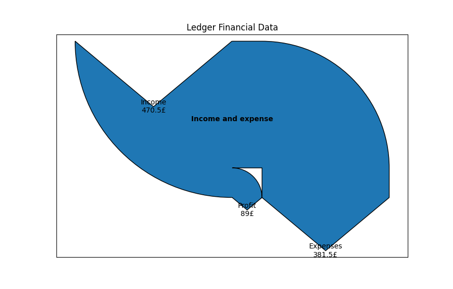
The diagram shows us some basic information about income, expense, and profit, but it would be nice to get a bit more of a breakdown.
Step 4: Add sub-accounts to the visualisation
To display more of a granular breakdown in the diagram, we need to make changes to the processing step (Step 2) and the display step (Step 3) above.
To begin with, modify the Account class so we can provide it with a reference to the account’s parent (if it exists):
class Account:
  def __init__(self, index, name, value, parent=None):
    self.name = name
    self.value = value
    self.parent = parent # A reference to another Account object
    ...
Next, modify the loop in which we create the accounts to detect parent accounts:
accounts = []
for transaction in transactions:
  t_accounts = transaction.account.split(':')
  for level, a in enumerate(t_accounts):
    account_name = ':'.join(t_accounts[:level + 1])
    parent_account_name = ':'.join(t_accounts[:level])
    account = next(filter(lambda a: a.name == account_name, accounts), None)
    if not account:
      parent_account = None
      if parent_account_name:
        parent_account = next(filter(lambda a: a.name == parent_account_name, accounts), None)
      account = Account(len(accounts), account_name, 0, parent_account)
      accounts.append(account)
    account.value += transaction.value
The code above performs various additional lookups to try and find parent accounts, and instantiates all accounts at each level in the Ledger file.
Finally, we can adjust the diagram-producing code to make use of the various accounts:
sankey = Sankey(ax=ax, unit='£')
for parent_account in filter(lambda a: not a.parent, accounts):
  children = list(filter(lambda a: (a.parent and a.parent.name) == parent_account.name, accounts))
  if len(children):
    sankey.add(
      flows=list(map(lambda a: a.value, children)),
      labels=list(map(lambda a: a.name, children)),
      orientations=list(map(lambda a: a.orientation, children)),
    )
  else:
    sankey.add(
      flows=[parent_account.value],
      labels=[parent_account.name],
      orientations=[parent_account.orientation],
    )
sankey.finish()
plt.show()
This code now iterates through each parent account (i.e. each account without a parent of its own). It then looks up the children of these accounts and creates a new Sankey segment containing the child accounts (or a single account for the parent if there are no child accounts).
Running the script again with the Ledger data should yield something like the following diagram.
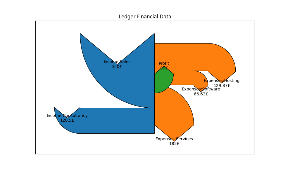
We now get more useful information being displayed, and we can see - at a glance - where the money is going.
Conclusion
Although we have made improvements to the diagram, there are still possible further enhancements that you may wish to explore, depending on your needs. For example, the current approach only goes two levels deep; the display stage would need to be amended to recursively navigate account levels to get an even finer-grained view.
I can recommend taking a look through the matplotlib Sankey documentation for more information on how you can tweak the diagram, or the documentation in general should you wish to explore other types of visualisations that you can pass the processed transactions in to.